Editing Tips: Typographic Rivers Explained
When proofreading a typeset text, such as page proofs for a book, you may need to keep an eye out for rivers. No, we don’t mean bodies of water. We mean gaps in the text.
To find out what rivers are and what to do with them, check out our guide below.
Rivers in Text
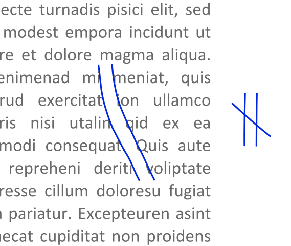
All text requires gaps between words (at least if you want it to be readable). Sometimes, though, the gaps between words on consecutive lines will align. This leaves a channel of white space running down the page, something typographers refer to as a “river.”

Rivers between words in text.
These rivers are not always a problem, but they can be distracting for readers. As such, many publishers and designers prefer to avoid rivers in typeset text.
What to Do with Rivers in a Typeset Document
Rivers and other spacing issues are not usually a problem if you are working on a document in a word processor (e.g., Microsoft Word). Typically, such text will be typeset if it is to be published, and the typesetter will address any layout issues when producing a proof version.
However, if you are working on a static, typeset text, your client may ask you to look out for issues with the layout. And this will typically include highlighting any rivers you spot.
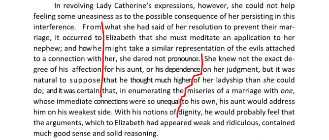
If you are working on a PDF, you could do this by highlighting it with a Sticky Note comment in Adobe Acrobat. Alternatively, you could use a suitable proofreading mark.

A marked up river in a passage of text.
Your client can then tweak the text or spacing to remove the river. The key is to have a clear system for marking up layout issues, which you will need to agree on with your client.
Becoming A Proofreader
You can find out more about typographic errors, as well as everything else you need to know to work as a proofreader, in our Becoming A Proofreader course. Sign up for a free trial today.


Your email address will not be published.