

How to Choose a Font for Your Document
You’ve put time and effort into crafting a piece of writing, and now it’s time to select a font style as the finishing touch. But with so many options, how do you know which one to pick?
Whether you’re working on a creative writing project or a professional resume, you should always choose a font that enhances readability and visual appeal while keeping the focus on your content. In this post, we’ll discuss how to choose a font for your (or your client’s) document, including:
- What are the different types of fonts?
- What’s the difference between a typeface and a font?
- What is a serif font?
- What is a sans-serif font?
- How to choose a font for your document.
Keep reading to learn more.
What Are the Different Types of Fonts?
Part of why choosing a font is so difficult is because there are thousands of different fonts and typefaces available: script, decorative, display, monospaced, etc. They each have their own unique characteristics, and your ideal font largely depends on your document and target audience. Here, we’ll be focusing on two popular font styles: serif and sans serif.
What’s the Difference Between a Typeface and a Font?
The terms typeface and font are often used interchangeably, but they have distinct meanings within the field of typography. A typeface refers to a set of stylistically related characters with consistent design attributes. It encompasses the overall visual appearance (such as shape and style) of a collection of letters, numbers, or other characters. Arial, Times New Roman, and Helvetica are all examples of different typefaces.
A font, however, refers to a variation of a typeface. It represents a specific style, weight, and size within a typeface family. Fonts are digital files that contain the information necessary to display a particular typeface on a computer screen or in print. For instance, Arial Regular, Arial Bold, and Arial Italic are all different font styles within the Arial typeface family.
What Is a Serif Font?
A serif is a typeface that features small lines or strokes at the end of a larger stroke in a character. These strokes can be thick or thin and contain several decorative variations and flourishes. Serif fonts are known for their legibility and traditional appearance, making them ideal for print materials such as books and newspapers.
Serif fonts have a long history and many believe they originated from the classical Latin alphabet and were initially designed to mimic the brush or chisel strokes used in stone carving.
As writing systems evolved and manuscripts were produced, various styles of serifs emerged. In fact, the first printed books in the 15th century used serif typefaces that imitated the handwriting of the time.
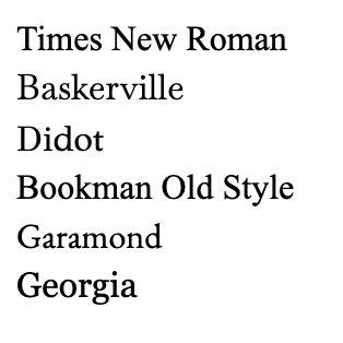
Some examples of widely used serif fonts include Times New Roman, Baskerville, Didot, Bookman Old Style, Garamond, and Georgia:
What Is a Sans-Serif Font?
A sans serif is a typeface that doesn’t have small lines (serifs) at the end of the strokes. The term sans is derived from the French word for without. Sans-serif fonts have a more clean, crisp, minimalist design than serif fonts. Due to their contemporary appearance, they’re ideal for digital content, such as websites and mobile apps, as they are generally more appropriate for short passages of text and user interfaces.
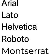
Some examples of sans-serif fonts are Arial, Lato, Helvetica, Roboto, and Montserrat:
How to Choose a Font for Your Document
Here are three factors to consider when choosing a font for your document:
- The purpose of the document
- The target audience
- Consistent implementation
1. The Purpose of the Document
Different fonts convey different tones and levels of formality, so it’s important to consider the purpose of the document when choosing a font. If you’re working on a document for a client and are unsure of their font preferences, check the brief or style guidelines. Some companies or brands may have established industry standards.
2. The Target Audience
Consider the target audience of the text when selecting a font, as different age groups and demographics have varying levels of reading ability and visual acuity. For example, if you’re writing a children’s book, you should choose a font that’s simple and easy to follow rather than fancy and complex. And if your target audience is seniors, avoid stylized, decorative fonts and stick to clear, readable ones like Times New Roman or Arial.
3. Consistent Implementation
No matter what font you choose, it’s important to apply it consistently throughout the text. When multiple fonts are used haphazardly, it can create a chaotic or disjointed look and appear unprofessional. The focus of your text should be your content, and inconsistent formatting distracts from your overall message.
Knowadays Courses
Do you want to learn more about how to apply and customize fonts in Microsoft Word? Our formatting course will teach you everything you need to know about typefaces and fonts, as well as a variety of other advanced formatting tools. Check it out today!


Your email address will not be published.