

7 Types of Infographics and When to Use Them
Did you know that there are several different types of infographics? Infographics have become a staple in digital content, offering a visually appealing way to present complex information. In this post we’ll explore seven types, as well as when to use them to complement your writing.
What Is an Infographic?
We’ve used the term, but it’s probably a good idea to set out what an infographic is. An infographic is a visual representation of information, data, or knowledge designed to present complex information quickly and clearly.
Infographics are often used to explain concepts, provide a quick overview of a topic, or summarize large amounts of data in a visually engaging way.
Why Are Infographics Effective?
Infographics are effective because they cater to the way our brains process information.
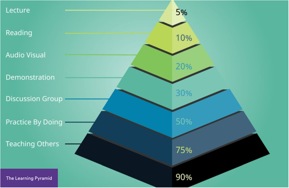
Studies, such as those carried out in the 1960s by Edgar Dale, show that people remember at least twice as much of what they see as what they read. Those studies have been regularly presented in an infographic – in the form of a pyramid – making the information easier to digest and remember:
By breaking down information into visually appealing chunks, infographics make it easier for readers to grasp key points and retain the information. And it’s a format that lends itself perfectly to social media, where it may be easily posted, skim-read, and shared.
7 Types of Infographics
Infographics come in a variety of forms suited to different types of content and communication goals.
Let’s explore some of the most popular types and discuss when to use them. We’ll take a look at an example of each type later.
1. Statistical
Statistical infographics are ideal for presenting data and statistics in a visually engaging way.
These often include charts, graphs, and percentages, making them perfect for any content that requires the presentation of numbers, such as:
- Reports
- Survey results
Use statistical infographics when you need to:
- Highlight trends
- Compare data
- Make numbers more digestible for your audience
2. Informational
Informational infographics are used to communicate a specific piece of information or message.
These infographics often include a mix of text and visuals, providing a concise overview of a topic. They’re great for:
- Explaining concepts
- Summarizing processes
- Offering tips
Use informational infographics when you want to:
- Educate your audience on a specific topic
- Provide an engaging summary of key points
3. Timeline
Timeline infographics are designed to showcase the progression of events over time.
They are particularly effective for illustrating:
- Historical events
- Project timelines
- The evolution of a concept
Use timeline infographics when you need to:
- Present chronological information
- Demonstrate how something has developed over a period of time
4. Process
Process infographics are used to explain the steps involved in a process or how something works.
They break down complex processes into simpler, more understandable chunks. This type of infographic is therefore ideal for:
- How-to guides
- Tutorials
- Workflow explanations
Use process infographics when you need to:
- Walk your audience through a series of steps
- Explain a process in a clear, logical order
5. Comparison
Comparison infographics are used to compare two or more items side by side.
They highlight similarities and differences, making it easier for your audience to make informed decisions. These infographics are useful for:
- Product comparisons
- Pros and cons lists
- Descriptions of options
Use comparison infographics when you want to show the contrast between different ideas, products, or services.
6. Hierarchical
Hierarchical infographics organize information into levels, typically displaying the most important information at the top.
They are effective for showing:
- Structures
- Rankings
- Organizational charts
Use hierarchical infographics when you need to display information in a structured format that emphasizes the relationship between different levels of data.
7. Geographical
Geographical infographics present data related to locations, often using maps as a primary visual.
This type of infographic is perfect for showcasing:
- Population data
- Market analysis
- Geographic trends
Use geographical infographics when your data is location specific and you want to illustrate a comparison between areas.
7 Infographic Examples
Seeing new information in an infographic can be at least twice as effective as reading it. Let’s take a look at some examples of how infographics have been used effectively in real life blog posts and articles.
We’ll go through them by type:
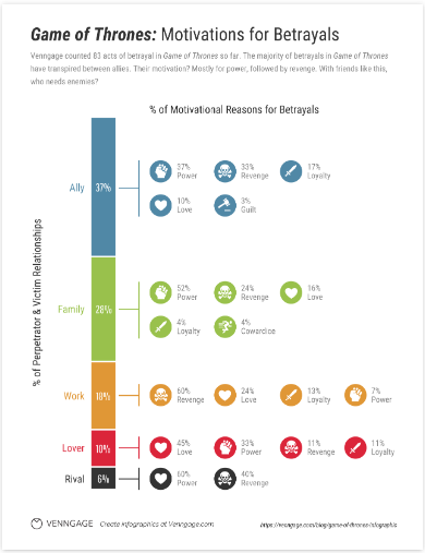
1. Statistical
Who says statistics have to be boring? In this infographic by Venngage, the motivations for the many betrayals in Game of Thrones are ordered and illustrated in a way that is simple to follow and – for those who are still catching up – avoids spoilers (but if you follow the link to the article, there may be spoilers, so beware!):
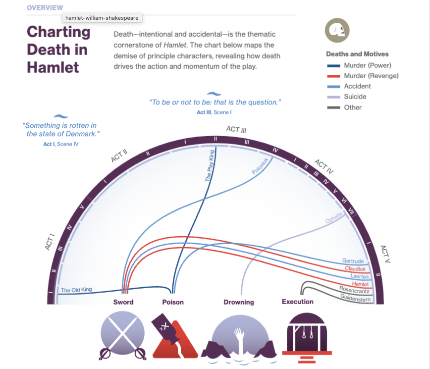
2. Informational
When it comes to summarizing key points in a neat visual, how about this overview from Course Hero? In this section of the infographic about Hamlet, one of the key themes is distilled into an engaging graphic that would help any student easily see when and how each of the characters is dispatched:
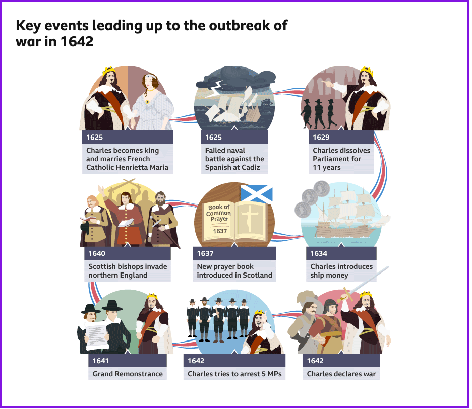
3. Timeline
Remembering dates can be a big challenge. Linking key dates to images, however, can help them stick in the memory – and make learning and revising more fun. This infographic from BBC Bitesize does just that, using an uncluttered style to illustrate a difficult passage in British history. It also shows how a timeline can be fitted into an easy-to-share square by using a ribbon to link the images in order:
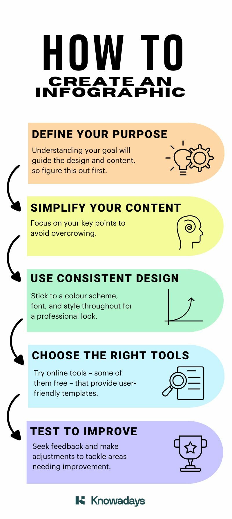
4. Process
We said that this type was ideal for how-to guides, so it would be remiss of us not to give an example of how our how-to guide could be summarized in infographic form. Using the free version of Canva, we adapted one of the templates and used a combination of arrows and rainbow colors to visually emphasize the suggested order. We chose simple diagrams to reflect each of the steps:
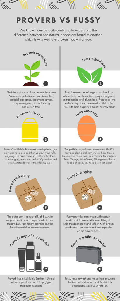
5. Comparison
Here’s an infographic from Proverb that effectively combines images and text side by side to give an at-a-glance comparison between two natural deodorants:
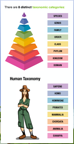
6. Hierarchical
This infographic from My Green World effectively illustrates the system devised by Carl Linnaeus for naming, ranking, and classifying all organisms. It does this by using a simple color-coded and labeled pyramid, and then applying the same color coding to show how those labels apply to an organism we’re all familiar with:
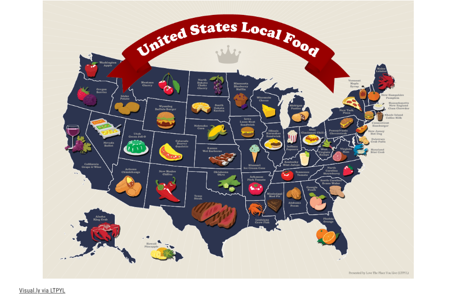
7. Geographical
This infographic from Wide Open Country combines a map, labels, and images to show, at a glance, the food (or drink) local to each state:
How to Create an Infographic
Now that we’ve shown how an infographic could benefit your content, you’ll need to know how to go about producing one. And yes, you can do it!
Creating an effective infographic requires a combination of good design, clear communication, and the right tools. Here are some tips to get you started. (Don’t panic if you read good design and you’re not a designer – we’ve included a tip to help you.)
1. Define Your Purpose
Before you start designing, clearly define the purpose of your infographic.
What message do you want to convey? Understanding your goal will guide the design and content of your infographic, ensuring it effectively communicates your intended message.
2. Simplify Your Content
Infographics are all about simplicity.
Focus on your key points and avoid overcrowding your infographic with too much text or data. Use images to represent information and keep your text concise and to the point.
3. Use a Consistent Design
Consistency in design is crucial for creating a professional-looking infographic.
Stick to a color scheme, font, and style throughout your infographic. This helps to make your infographic more aesthetically pleasing – and therefore more likely to be viewed and shared.
4. Choose the Right Tools
You don’t need design experience to create a useful infographic; you just need the right tools.
Websites like Canva, Piktochart, and Venngage offer user-friendly and customizable templates – with some free options – making it simple and affordable to design professional-looking infographics. (Are you feeling better about that part now?)
5. Test to Improve
Once you’ve created your infographic, test it with a small audience – ideally from your target audience – to get feedback. This will help you identify any areas that may need improvement.
Don’t be afraid to make adjustments to your design to ensure it effectively communicates your message – that, after all, is what it’s for.
Becoming A Freelance Writer
As you’ll have seen, infographics are great for:
- Conveying complex ideas in a concise manner
- Boosting engagement
- Increasing shareability
Whether you’re presenting data, explaining a process, or comparing options, there’s an infographic type that can help you communicate your message effectively. And if you want to learn more about effective communication, why not try our Becoming a Freelance Writer course? You can even try two lessons for free.


Your email address will not be published.